This project involved refining studio-shot product images and adapting them into a cohesive carousel format. The goal was to enhance visual harmony while highlighting each color variant through a clean and elegant presentation.
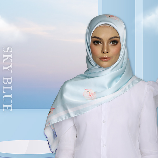
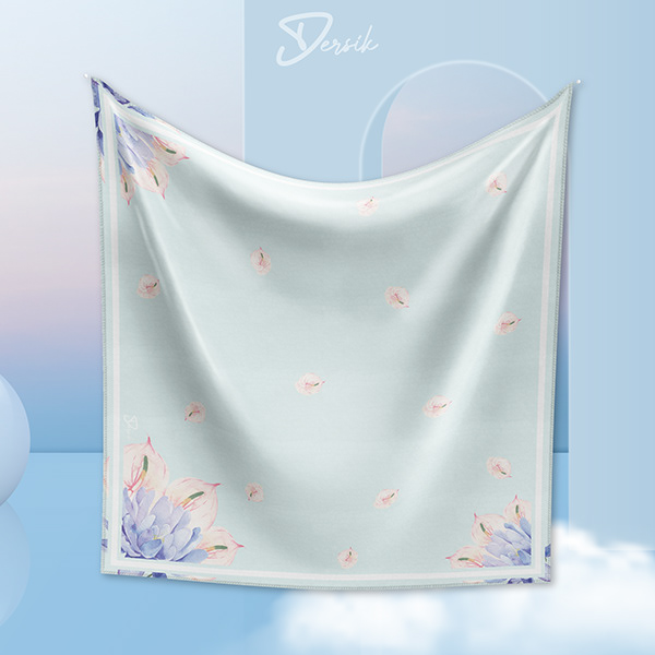
Sky Blue
A calm and refreshing visual tone inspired by blue floral elements. The design highlights softness and elegance while keeping the product clearly visible.
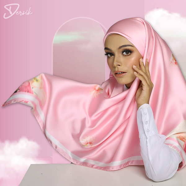
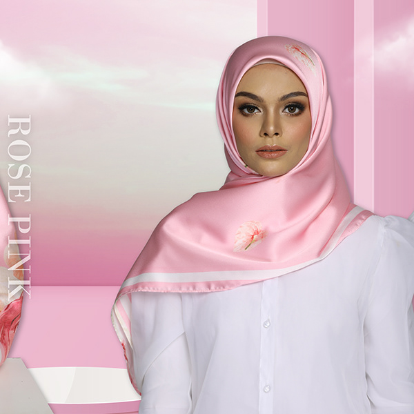
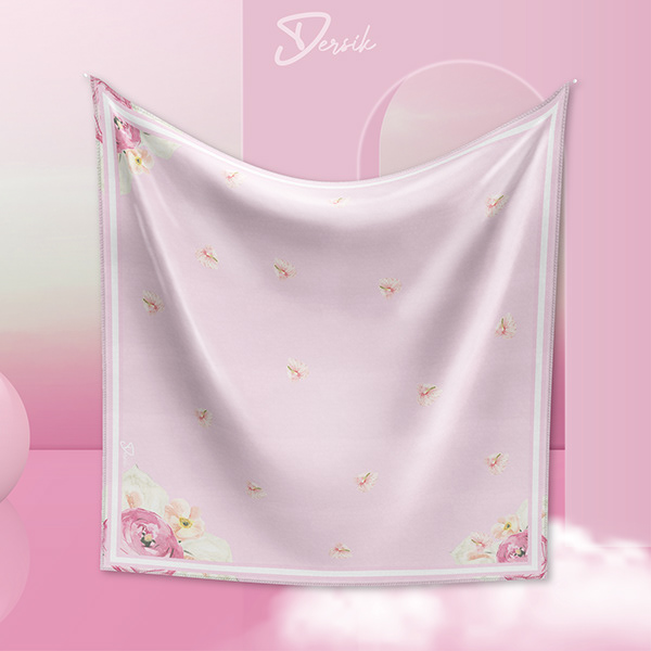
Rose Pink
A gentle and romantic color direction supported by pink floral accents. This visual aims to convey femininity and warmth through balanced composition.
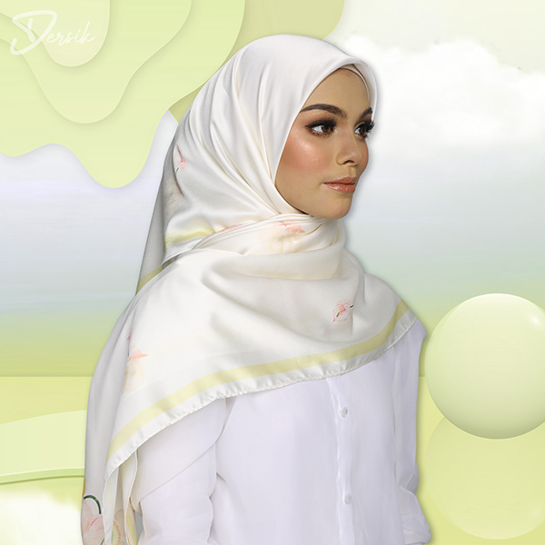
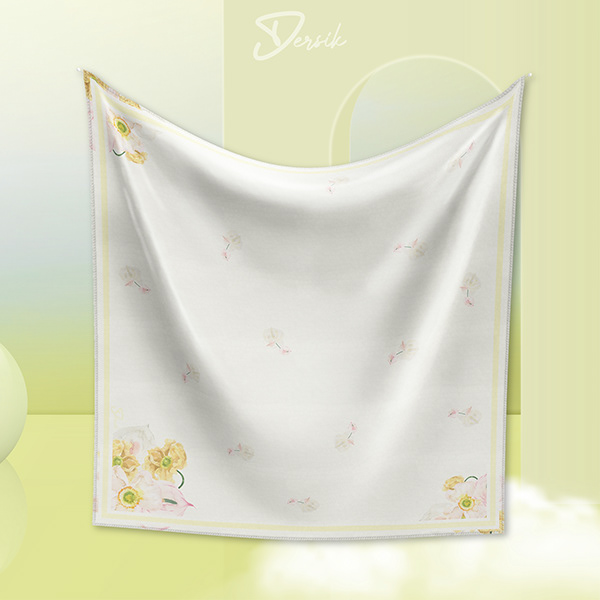
Sunny
A bright and cheerful presentation inspired by yellow floral tones. The layout enhances vibrancy while maintaining a clean, editorial feel.
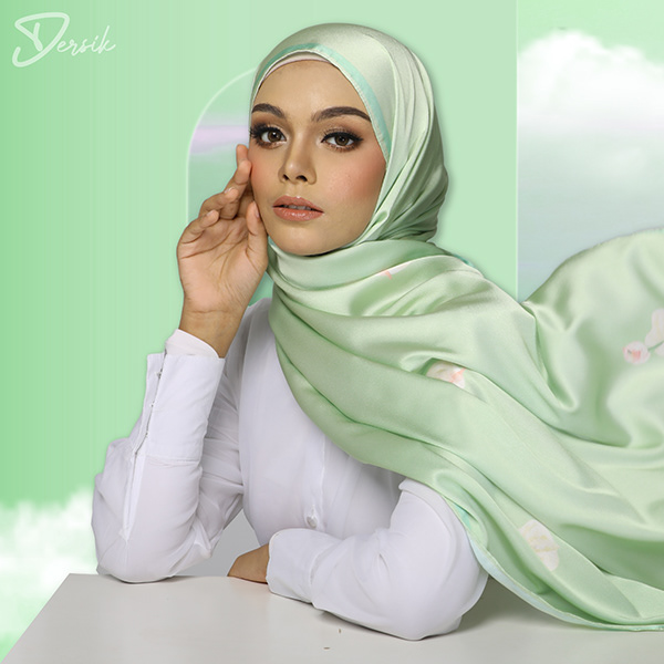
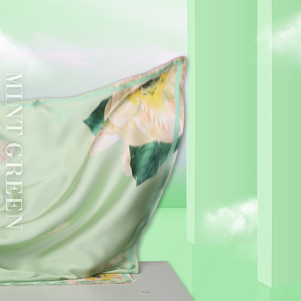
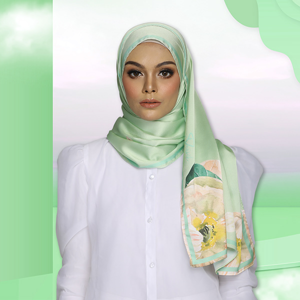
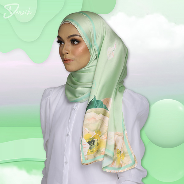
Mint Green
A fresh and soothing visual approach using green floral elements. Designed to communicate natural elegance and visual calmness.